


How to choose the perfect grout color
- Studio Tile & Design
- Dec 29, 2022
- 4 min read
Updated: Dec 30, 2022
After careful deliberation, you have selected your tile. You're feeling confident, feeling accomplished. You're trying to visualize the end result. You're asking for an estimate. But wait just a minute, where do you think you're going? It's time to select your grout!

For one reason or another, grout is a source of anxiety for most clients. You hate to clean it. You hate when there is a lot of it. And if the wrong color is chosen, you really hate to look at it. I can't tell you how many times clients will say, "Oh, no! You mean there are multiple grout colors?" Yes, there are a lot of options when it comes to grout colors—and that's a good thing!
To quote Charles Eames, "The details are not the details. They make the design." Grout color is one seemingly small detail with the potential to make a major impact on the overall look of your tile. The right choice can make a good tile great, while the wrong choice can totally ruin the look. And with so many color choices available, how do you begin choose? This is our guide to getting it right every time.
Blend in with the Surroundings
The idea here is that the best grout to see is no grout. By choosing a color that totally blends with the tile, you will get a very seamless look. This allows you to focus less on the tile joints and focus more on the pattern of the tile itself—and hello, that's what you're paying for! Why distract from it? Our trick for picking the perfect blend: If it disappears when you squint your eyes, it's a match.


Keep it Monochromatic
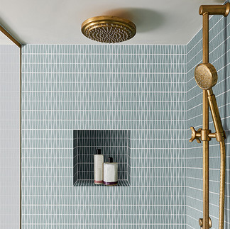
If you don't want your grout lines to disappear completely, choose a color that is only one or two shades lighter or darker than the background of your tile. This will subtly accentuate the shape of your tiles, providing a soft detail without drawing too much attention to the grout lines. This gives your space a cohesive and streamlined appearance. Monochromatic grout can also be easier to maintain, as it does not show dirt and grime as readily as a light or contrasting grout color might. Overall, a monochromatic grout color is a practical and aesthetically pleasing choice.


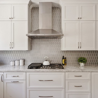


Using a blending or monochromatic grout color can help to make a small space feel larger, as the lack of contrasting grout lines gives the illusion of a more seamless surface.
Consider Contrast
Some tiles necessitate a bold, contrasting grout color in order to truly shine. This is especially effective in cases where the shape or layout of your tile is more interesting than the tile itself. A bold grout color can help to frame and enhance your tiles, accentuating your tile layout by drawing attention to the unique features of the design. For example, a black grout could be used with white subway tiles to create a modern, graphic look, while a bright white grout makes a cerulean tile pop.


Use Grout to Emphasize a Particular Color
On a multi-colored tile that could be paired effectively with several different grout colors, you have the opportunity to choose which one to accentuate. We recommend taking cues from your wall colors, cabinetry, or countertops. Selecting a color that is already in use elsewhere in the room helps to subtly tie everything together in a way that feels just right.


Use Grout for a Pop of Color
Our standard grout chart is a sea of neutrals, because the fun colors aren't for everyone. However, if you're feeling daring, we will take you as far as you want to go. Especially on white tiles and tiles with interesting shapes, choosing a color like navy, yellow, or hot pink is a delightful way to elevate your space. You can even choose from a wide range of metallic, iridescent, and glittery grout colors if that is your thing!


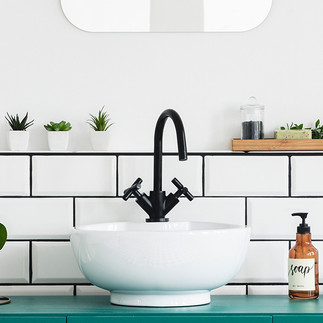
White Goes with Everything
This tip is pretty explanatory. Whether you're blending in with white tiles, adding a soft contrast on a neutral tile, or making a brightly colored tile pop, white grout works with just about every color combination.


By the way, so does Silverado. If you know, you know.
Special Situations
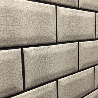
Use light or blending grout colors on white marble and encaustic cement. This one really isn't negotiable since darker grout pigments can bleed into these porous materials, discoloring the edges. You will also want to use a light or blending grout on crackled tiles, unless seeing each & every little crackle is your intention. When grouting glass tiles, ask for a grout that uses glass as the aggregate instead of sand. Many of these are slightly translucent, an effect that is totally lost on opaque tiles but looks lovely beside transparent or translucent glass. And finally, don't select white grout if you're not going to keep it clean. You know who you are.


Most Importantly: Don't Overthink It!
As you were reading this, what resonated most with you? Remember, design is subjective. Ultimately, it is your house, and you should do whatever feels most comfortable. If you're happiest when everything is simple and clean, choose a grout color that blends. If you want a bit more drama, play up the contrast. And when in doubt, ask a designer. After all, that's why we're here!